Creating Beautiful Duotones Right Within Lightroom Mobile
Mornin’ everybody, and Happy Friday!
Back in December Adobe added a few important new features into Lightroom Mobile, and one of my favorite is the ability to create duotones right within the mobile App, thanks to the inclusion of the Split Toning feature from the Desktop version (and it’s very nicely implemented). Here’s how I it use it to make duotones:
STEP ONE: Here’s the original image I put in a Collection in the Desktop version of Lightroom (Lightroom CC), and then I sync’d this collection over to Lightroom mobile. I clicked on this image in the collection to edit it.
STEP TWO: Tap once on the Adjust icon at the bottom right of the screen to bring up the Adjustment Tiles, then tap on the B&W tile to convert the image to Black & White (as seen here — the red dot represents where I’m tapping).
STEP THREE: Now tap on the lens opening icon at the far left of the Tiles to bring up a pop-up menu of other adjustments and that’s where you’ll find the new Split Toning feature. Tap on it once to switch to the Split Toning options.
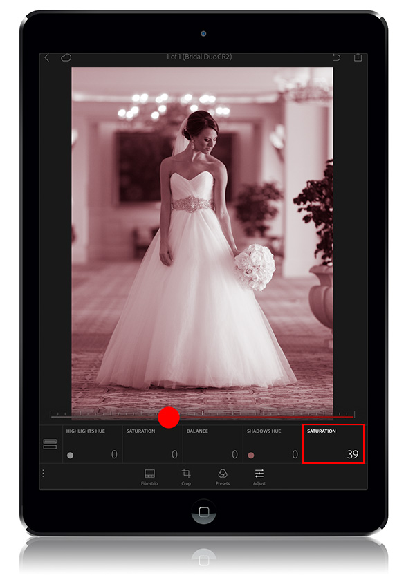
STEP FOUR: When you enter this mode, an adjustment slider appears at the bottom of your image so you can control the amount of adjustments you choose in the tiles below it. You really can’t see the color until you raise the Saturation amount, so tap on the Saturation adjustment tile (shown in a red rectangle above), then tap and drag that slider to the right until you can see the color fairly vividly (at this point, I crank it higher than I know I’ll want it, but the easier it is to see the color, the easier it will be for you to choose the right one).
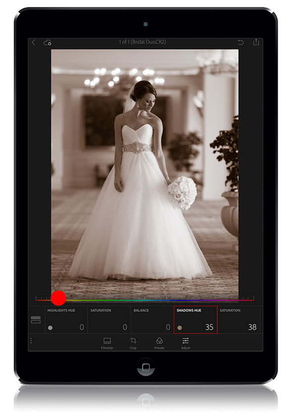
STEP FIVE: Now tap the Shadows Hue tile (I put a red rectangle around it above), then drag the slider (see the red dot) over to the color you want. I usually choose a brownish hue, as seen here.
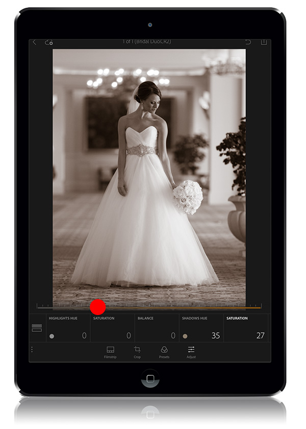
STEP SIX: The final step is to lower the Saturation amount until it looks right to you (here I tapped back on the Saturation tile, then dragged the slider from a Saturation amount of 35 down to 27, as seen above). The key here is: don’t mess with the Highlights Hue or Balance adjustment. Just use the Shadow adjustments and that’s it.
Hope you find that helpful (and my thanks to Adobe for continually upgrading, tweaking and improving Lightroom Mobile — they’ve even had another update where they snuck a few features, bug fixes and tweaks since the one late last year).
Best,
-Scott
P.S. Looking forward to meeting some of you in person next week in Richmond and Atlanta.

