How to Make Multi-Photo Layouts For Social Media in Lightroom
Hi, everybody! I’m back from a weeklong barnstorming seminar tour on the West Coast, and I had so much fun! Met lots of great folks who read this blog daily; saw some old friends, and make some new ones. It’s so much fun teaching Lightroom and really seeing the lightbulb come on for people – I love it! 🙂
Today we’re looking at how to create layouts for social media, using a feature that’s a bit hidden in Lightroom’s Print Module that lets you do these cool multi-photo layouts and then use them on social. Here’s how it’s done:
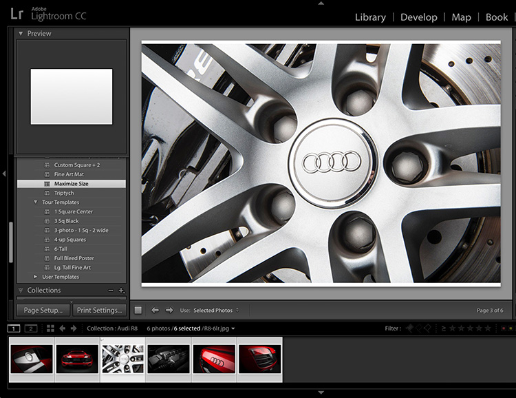
STEP ONE: Put the images you want to appear in your multi-photo layout into a collection, and then jump over to the Print Module. In the list of Templates that come with Lightroom, click on Maximum Size (as shown here), just as a start point.
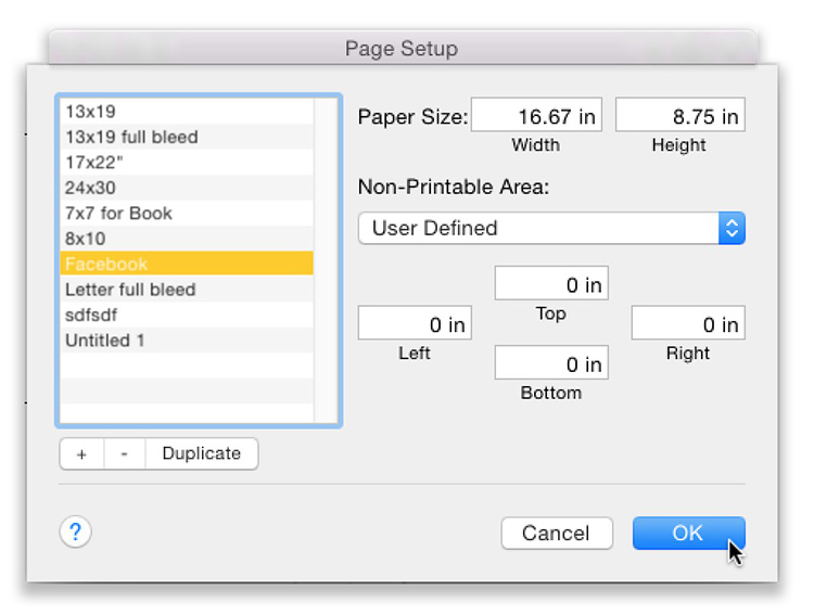
STEP TWO: Now click the Page Setup button at the bottom of the Left Side Panels to bring up the Page Setup window you see above. In the Paper Size fields, the recommended ideal Facebook image size is 16.67 inches by 8.75 inches (which translates to 1200 pixels wide by 630 pixels deep, but the Print module uses inches, so I just did the math for you). Towards the bottom, where it says “Top, Left, Right, and Bottom” – those are your page margins for printing. Set them all to 0 inches as shown here. Lastly, click the + sign under the list of presets on the left side to create a new preset and name this one Facebook so you don’t have to do this again — it’ll be saved from now on as a Preset Size you can choose with just one click.
If you were making this layout for Instagram (rather than Facebook), which uses 1080 x 1080 as its ideal size – instead you’d use 15 inches x 15 inches for your page size.
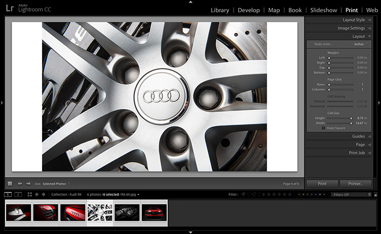
STEP THREE: Now your selected image will look something like this with your new page size. Now, in the Right Side Panels, click on the Layout panel — that’s where we’ll create our multi-photo layout.
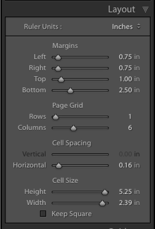
STEP FOUR: In the Page Grid section you can choose how many Rows and Columns you want in your layout and the margins for the page. Let’s create the same margins on each side: .75 of an inch, with 1-inch at the top and 2.50 inches at the bottom so we have room to add our logo or name at the bottom of the layout.
For Rows and columns, in this case, we’re going to have 6 columns (and just 1 row), so just slide the Columns slider to the right until it reads 6, as seen here. This will put your six selected images right up against one-another with no space between (they will butt up against each other). If you want space between your images (I usually do), then under Cell Spacing drag the Horizontal slider to the right a bit to create that space.
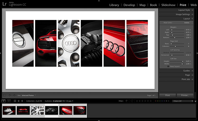
STEP FIVE: Here’s how the layout now looks with your six columns in place with a small space between each column. If you want more space (or less) use that Horizontal Cell slider to change the spacing. Next, let’s add our name plate or text or logo in that bottom area below the images.
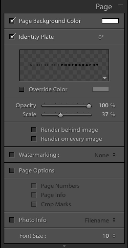
STEP SIX: To add text (or a graphic) to your layout, you use the Identity Plate feature, so go to the Page panel and turn on the Identity Plate checkbox. Then, go customize the text, click in the right corner of the Identity Plate preview, on the light-gray downward facing triangle to bring up the Identity Plate editing window (shown below).
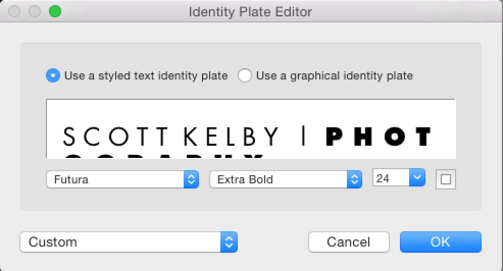
STEP SIX: You can type in your text (here I used the font Futura Light in all caps for my name, and then Futura Extra Bold for “Photography”). I also put two spaces in-between each letter to make it look better, but that’s just a style thing – not required at all.
If you want to save your text as a preset, click and hold on the ‘Custom’ pop-up menu and choose Save As to save it to that menu. If you want to upload a graphic from your computer, like your logo or your signature, you’d click the ‘Use a graphical Identity Plate’ button instead.
NOTE: Don’t forget to go to the Template panel and save this new layout — size, text, layout, etc.) as a Template so in the future this whole layout is only just one-click away.
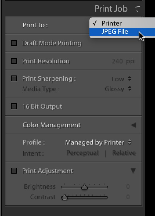
STEP SEVEN: The final step is to go to the Print Job panel and the pop-up menu top right where it says ‘Printer’ – click and hold on that and choose JPEG file (as shown above) to export your layout as a JPEG file, ready for uploading to Facebook.
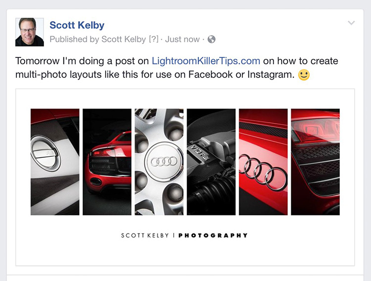
STEP EIGHT: Here’s the final layout as it appears on my Facebook page.
Hope you found that helpful. 🙂
NOTE: Over on my daily blog today I have some info on shooting the eclipse, along with an update on the Worldwide Photo Walk. Here’s the link if you’ve got an extra sec.
Have a great Monday everybody!
-Scott
P.S. My next Lightroom seminar is in Denver next month. Hope you can make it if you’re out that way. 🙂

