How to Make Lightroom’s Improved “Auto” Button Even Better!

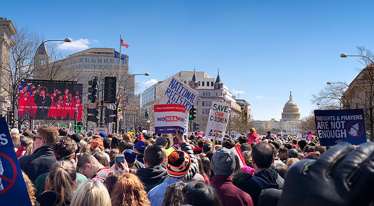
Hi, gang and greetings from Washington DC (my family and I took a walk down Pennsylvania Avenue Saturday with about 800,000 other folks). 🙂
By the time you read this though, I’ll be in Atlanta for my seminar today (well, that’s the plan anyway), and I’m delighted to have over 300 photographers spending the day with me here learning Lightroom. I’ll be in Milwaukee on Wednesday with the seminar – maybe I’ll see you there?
After Adobe’s recent Lightroom Classic update which featured a much enhanced one-click Auto tone button (and it is much better) I’ve been using it more and more as a starting place, but I’ve noticed something about it, and that is, depending on the image it can actually make your image look a little bit “HDR’d.” Ack! Luckily, if this happens to you it’s an easy fix. Here’s what to do (well, here’s what I do anyway).

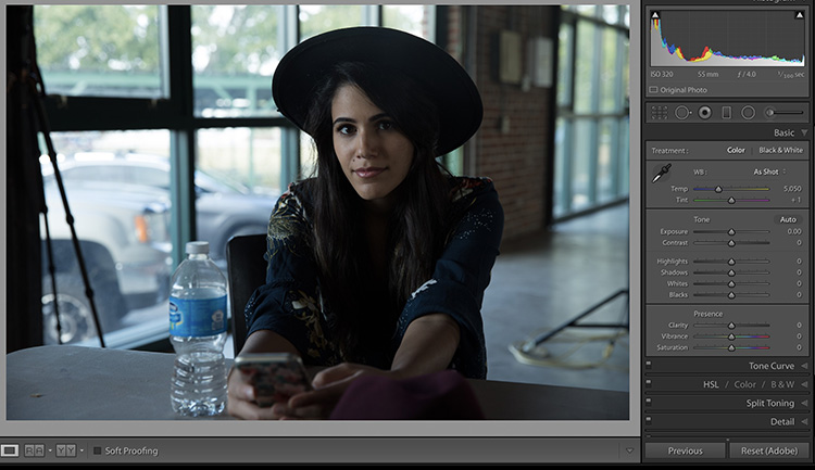
Above: Here’s our original image (it’s just a behind-the-scenes shot taken between shoots on location).

STEP ONE: When you click the Auto Button, you get this look, which is certainly better, but to me, it doesn’t look very natural. In fact, it has a little bit (or a medium bit) of HDR-look to it. I think there are two reasons for that, and they are both characteristics of the new Auto button’s algorithm: (1) The shadows are opened too much (the slider is way too far to the right), and (2) the Contrast amount is lowered.

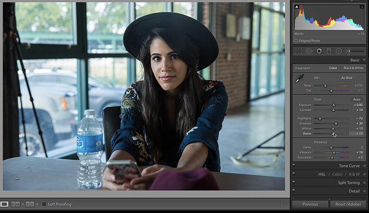
STEP TWO: To get a more natural look, after I click the Auto button I generally do this:
(1) Lower the Shadow amount to around 1/2 of what the Auto slider bumped it up to. The Auto feature set the Shadows to +59, I lowered them down to +30.
(2) Bring the Contrast back up to at least 0 or higher into the + side. How far to drag it is a judgment call based on the image you’re working on, but I usually at least take it back to zero, if not a bit higher.
(3) I increase the Exposure amount a little bit (here I went from Auto’s +45 up to +85, nearly doubling the amount).
(4) Then I drag the Blacks slider to the right a bit (it opens the shadow areas back up without giving it an HDR look).
This only takes 10-seconds, but you wind up with a really good starting point for more tweaking (or even a finished edit).
The next time you hit Auto and it looks funky (HDR’d) give this tweak a try and see if you don’t like the results a whole lot better. 🙂
Hope I get to meet you here in Atlanta today. 🙂
Best,
-Scott
P.S. Check out this new video trailer for the upcoming Photoshop World Conference in Orlando in June. Makes ya wanna go, doesn’t it? Awwww, yah!

