Seven Features Adobe Could Add To Lightroom Classic That Would Make a Big Difference
OK, I’m going to take the most obvious feature, (a Layers feature) off the table for this list, because I think it would be the least likely to be added. If they did add Layers to Lightroom, the need for Photoshop would drop like a rock, and I don’t see Adobe letting that happening any time soon, so I came up with a more realistic list — all stuff that Adobe could do — it’s all within reach — but would take Lightroom Classic to the next level quick. Here goes:

(1) Add a High-Res Cloud Storage Option
I don’t want to switch to a different program. I love Lightroom Classic. But at the same time, I would love the option to back up my most important images to Adobe’s cloud, and I’d gladly pay a monthly subscription fee for it, (and I’d like to keep using Classic without having to switch to a different program). We can already send Smart Previews to Mobile via Lightroom Classic so the technology is already there in Classic — just turn on a switch that would let us sync selected full RAW or high-res final images to the cloud (for a monthly subscription fee), and I’d be all over it. I’d love an option to make a backup copy of my catalog there too. You already have a sync preferences tab (see below), it’s just missing one button.
(2) Give us “Photo Mechanic” style speed
Lightroom Classic keeps getting faster at importing and previewing recently imported images, but it’s still not nearly as fast as Photo Mechanic (see the video above). I know that Adobe knows exactly how PM does it, but for some reason, they stop short of giving us that speed. It’s time to take the governor off and give us that type of speed.
(3) Improve the Slideshow Module
It’s just so, so bad. It’s essentially the same as it was in Lightroom 1.0. Adobe just revisited the Book Module and made some really great improvements there, making it better and more relevant than ever. The Slideshow needs some love, too. Make the slideshow module great (and it wouldn’t take all that much).

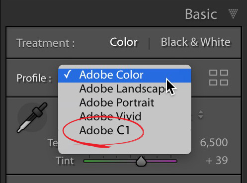
(4) Give us a Capture One Style RAW Profile
You’ll read people online going on and on about how your RAW images look better in Capture One than they do in Lightroom. Capture One isn’t using some special secret sauce — it’s just that their default setting for RAW images applies a bunch of settings to the image (instead of giving you the flat, more realistic rendering that Lightroom provides). We know from Martin Evening’s excellent cover story in Lightroom magazine (which compared the RAW conversions from both) that default settings for Capture One’s RAW conversion add a “look” to your RAW images, with Clarity applied, and more contrast and vibrance, and so on. He also showed that you can get a very similar look in Lightroom by tweaking Lightroom’s settings to look like Capture One’s default setting. So…I’d love to see Adobe give us the option of choosing a real RAW profile that matches the default look of Capture One. Not a Develop Module preset — an actual RAW Color profile (and no, none of the new batch of Adobe’s RAW profiles comes even close to the look of Capture One).

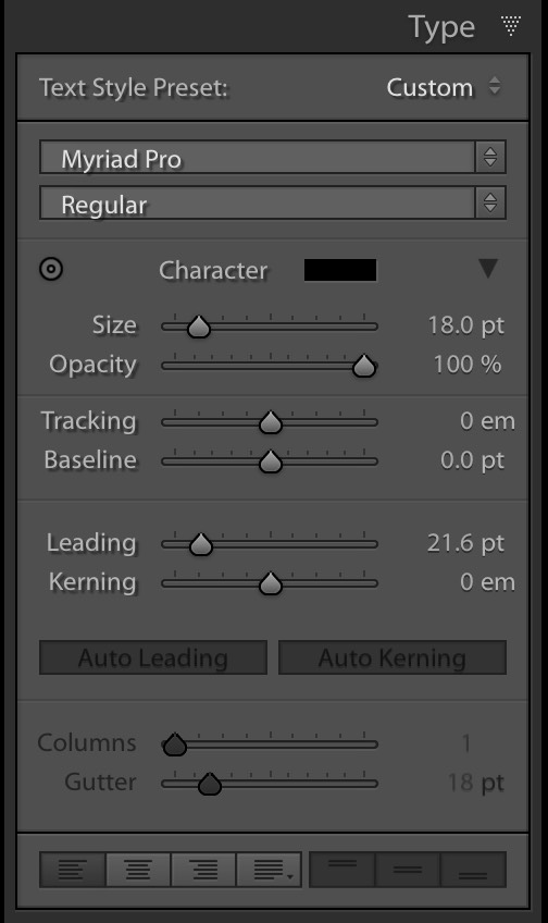
(5) Give Us Some Decent Type Features
This should be a no-brainer — just add the Type features from the Book Module to the Print Module and Slideshow module. You already have these features in Lightroom Classic (see that panel right above there? That’s the one). It’s already there in the Book module. Just duplicate it over into those other two modules. Boom. Done.
(6) Give us customizable keyboard shortcuts
There are certainly some that could be easier but beyond that there a bunch of things in Lightroom Classic that don’t have keyboard shortcuts at all. This would speed our work big time! Most (if not all) other Adobe applications already have this feature (including Photoshop) – it would be awesome to add this one.
(7) Give us Photoshop’s Healing Brush
It’s been in Photoshop since 2002 (16 years now) — and yet the ‘Spot Removal’ tool in Lightroom Classic is…well…I’m sorry Adobe — it’s awful. AWFUL!!! It’s only good for removing actual spots, and then only sometimes. On the other hand, Photoshop’s Healing Brush is absolutely awesome! Always has been. For 16 long years. Just copy a version of it over to Lightroom Classic and you’ll have really done something big.
I could come up with a list of smaller little tweaks and enhancements for Lightroom that would last all day, but these items are a little bigger, but still all seemingly within reach.
Let me know which ones are on your list down in the comments section. Which are you pet features? What are the ones that would change the way you work in Lightroom Classic forever? I’d love to hear ’em.
Have a great Monday, everybody! 🙂
Best,
-Scott


