Creating Contact Sheets With a ‘Slide Mount Look’ in Lightroom
I was looking online this week and saw an old sheet of color slides in those plastic sleeves where we used to store them in folders, and it made me start thinking about how cool it would be to have something like that in Lightroom where you could just click a button or two and it be there, so I set out to figure out how, and it’s easier than you’d think.
It takes a little Photoshop up front (simple stuff), but once you’re done, you don’t have to go back to Photoshop at all again for this effect — it will live inside of Lightroom from here on out, just one click away. Here goes:
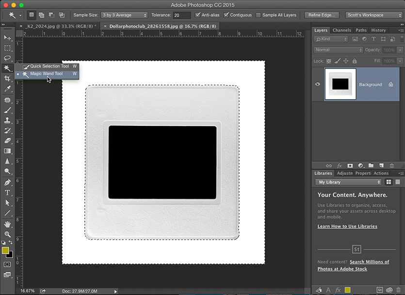
STEP ONE: I went to DollarPhotoClub.com, did a search for Slide Mount, and bought the stock photo of a slide you see above for (you guessed it), $1. I opened the stock slide mount in Photoshop and used the Magic Wand to select the white around around the slide mount (as seen here).
STEP TWO: Now go under Photoshop’s Select menu and choose Inverse. This switches the selection from the white background to the outside of the slide. Press Command-J (PC: Ctrl-J) to put the slide up on its own separate layer. Now go to the Background Layer (over in the Layers panel) and delete it by dragging it to the trash can at the bottom of the Layers Panel. Now your slide is setting on a transparent background.
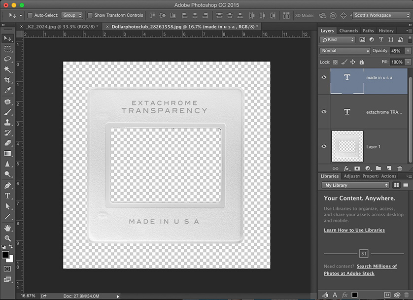
Of course, the center of the slide is still solid black (see how it looks back in step one), so click your Magic Wand tool inside of that black area to select that area, then just hit the Delete Key (PC: Backspace) to delete that black area, which makes that area transparent (as seen above). Now you can add some text if you like (totally optional), and in this case I did, top and bottom, and I lowered the opacity of both text layers to 45% so the black text would be more like light gray text (as seen above).
If you created that optional text, then you’ll need to merge your text layers, and your slide layer, all into one single layer. In the Layers panel, hold the Shift key and click on all three layers, then press Command-E (PC: Ctrl-E) to merge them into one single layer. OK, good job. Lastly,
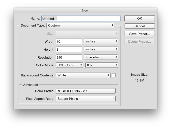
STEP THREE: In Photoshop, create a new black document that is the size of the image you want this template to appear over. In my case, I wanted it sized 8×10″ in wide format (so 10″ for the width), and I did it at a resolution of 240 so I could use it in print if I wanted. Now click OK. Go back to your slide document: press Command-A (PC: Ctrl-A) to “Select All” and then Copy this slide into memory (the old Command-C/Ctrl-C regular copy thing).
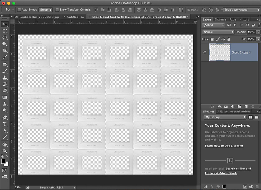 STEP FOUR: Now switch to your new blank document and Paste that slide into your new document, and drag it up in the top left corner. Then paste another and put directly to the right of that one, and continue this until you have a whole row of slides. Continue copying and pasting (or Option-Dragging) slides until you fill the whole 10×8″ document like you see here, with slides. Then, go to the Layers panel and delete the Background layer so there’s no background behind your slides (the background is now transparent — that’s what that checkerboard represent — the transparent areas). OK, the last part of this Photoshop stuff is to save this file in a File Format that will retain that transparent background when you bring it into Lightroom (where it will live from here on out). That File Format is .PNG. So, choose Save As from the File Menu, and from the Format pop-up menu choose .PNG; then click Save and it will save a copy of your file in .PNG format. OK, we’re done with Photoshop. It was easy enough, but it took a few steps for sure.
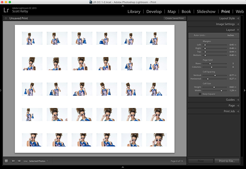
STEP FIVE: Go to Lightroom; click on the collection of images you want to appear in this slide layout, then jump over to the Print module (you don’t have to print this layout — you can save it as a JPEG and use on the Web or whatever, but we build it in this module). I put the number of columns and rows here (5 Rows; 6 Columns), and the approximately margins for a 10×8″ page. Just use the settings you see here, and what you see on screen is what you’ll get, but with different pictures, of course.
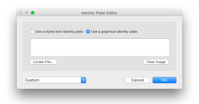
STEP SIX: Now, in the Right Side panels go to the Page panel; turn on the checkbox for Identity Plate, and in the bottom right corner of the Identity Plate preview (right inside the Page panel), click and hold on that little white down-facing arrow, and choose Edit. That brings up the Window you see above, the Identity Plate Editor. Click on the button up top for “Use a graphical Identity plate” then click the Locate File button. Now find that .PNG file you saved with all those slide mounts (the one with the transparent background). Then click OK.
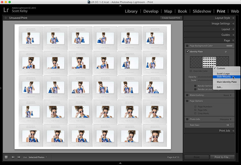
STEP SEVEN: Once you do this, your slides will appear over your images in the Print Module (as seen here). If you need to tweak the size of your images that appear inside the slide back in the Page panel, using the Margins; cell spacing and cell size. To save this slide overlay sheet inside of Lightroom so you can pull this up anytime you’d like (without having to reimport it), you do that by going back to that Identity Plate Editor (choose Edit from that same pop-down menu). Then, once the Identity Plate Editor window is open, click and hold on the “Custom” pop-up menu in the bottom left corner and choose ‘Save as’ and then give your template a name (I named my “Slide Mounts.” I know. How original). Now, these Slide mounts will appear right in the Identity Plate Editor pop-down menu, as seen above.
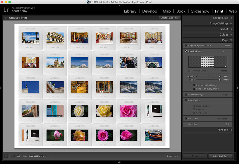
STEP EIGHT: To apply this same look to another collection; just change collection and bam — you got it (as seen here). It’s helpful to Save this as a “Print” so at least the columns, rows and spacing are all just one click away. Also, if you want to save this image as a JPEG, go to the Print Job panel, and at the top right where it says “Print to” click on that pop-up menu and choose JPEG, then click the Print to File button at the bottom right of the column and it saves this page as a JPEG.
OK, there ya have it. It’s a lot of steps, but thankfully they’re all easy.
Hope you have a hair-raising Tuesday (how’s that for a salutation) and we’ll see ya back here tomorrow. 🙂
Best,
-Scott

